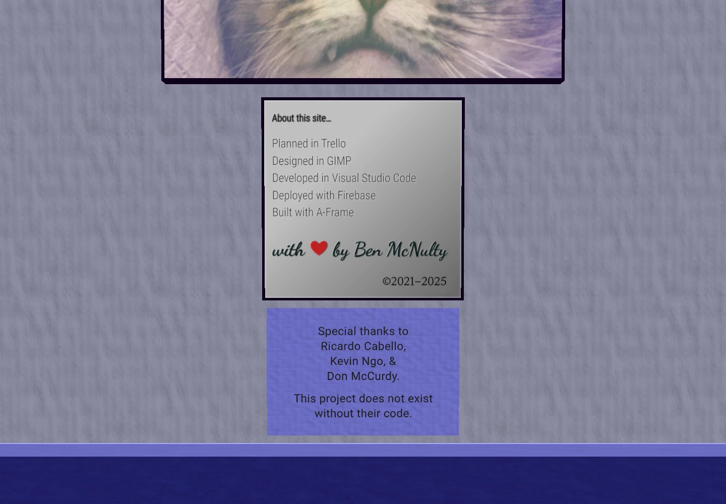
My WebXR portfolio had become a time capsule. The client work was still worth showing. So were the experiments with games, broadcasts, 360-degree media, and spatial interfaces. But the room holding all of it had fallen behind the rest of my site. Some of the writing was out of date. The materials looked like placeholders. Even the little “About this site” sign was an image of text that had been edited to change the copyright years.
I wanted to keep the room and the history in it. I also wanted someone considering me for a job to be able to walk through it and find a current, cared-for piece of software.
I worked through the refresh with GPT-6 in Codex. The useful part of that collaboration was the iteration: inspect the existing implementation, make a bounded change, test it, then put on the headset and see what the tests missed. My first Quest 3 pass looked much better and felt smooth. It also gave me a very specific list of things to fix.
Keeping the gallery, replacing the machinery
The original scene used A-Frame. That was a useful way to build the first version: describe the room in HTML, attach components, and get into a headset quickly. Over time, the page accumulated dependencies and behaviors that were harder to inspect together.
The refreshed gallery uses Three.js directly, with WebXR for the headset session and cannon-es for device physics. The exhibits, positions, text, and material choices live in a scene manifest. Loading, rendering, navigation, grabbing, and session management have separate modules.
That separation matters when something goes wrong. If a tablet moves strangely, I can inspect its body and the hand holding it. If a sign is hard to read, I can change its lettering without rewriting the movement code. The project images and arrangement still tell the same story.
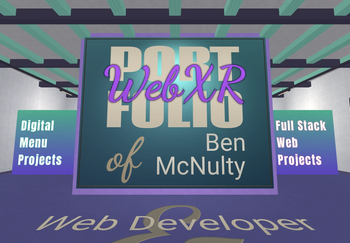
The comparisons in this post use the same camera position, direction, field of view, and image dimensions. I captured the old version from the live site before replacing it. The refreshed views come from the local build. These are browser captures, not headset recordings; navigation overlays are hidden in both versions so the room is easier to compare. Tap an image to inspect it at full size.
| Original live gallery | Refreshed gallery |
|---|---|
 |  |
Lighting that helps me read
The first lighting pass made the room feel more coherent, but it also made parts of it drab. Brightening everything would have brought back the washed-out look I was trying to leave behind.
The more useful change was to decide what should produce light and what should receive it. The description panels now read as light boxes. Photographs have illuminated frames. Large section headings keep a crisp white face with colored light inset behind the letters. The room has warmer rugs, richer teal timber, mineral walls, and a few restrained decorative details. At the entrance, the big WebXR script is now a rich violet against a softly graded teal enamel panel. The saturated lettering and softer backdrop make that first view feel more welcoming, while a dark edge keeps the script readable where it crosses the large portfolio letters.
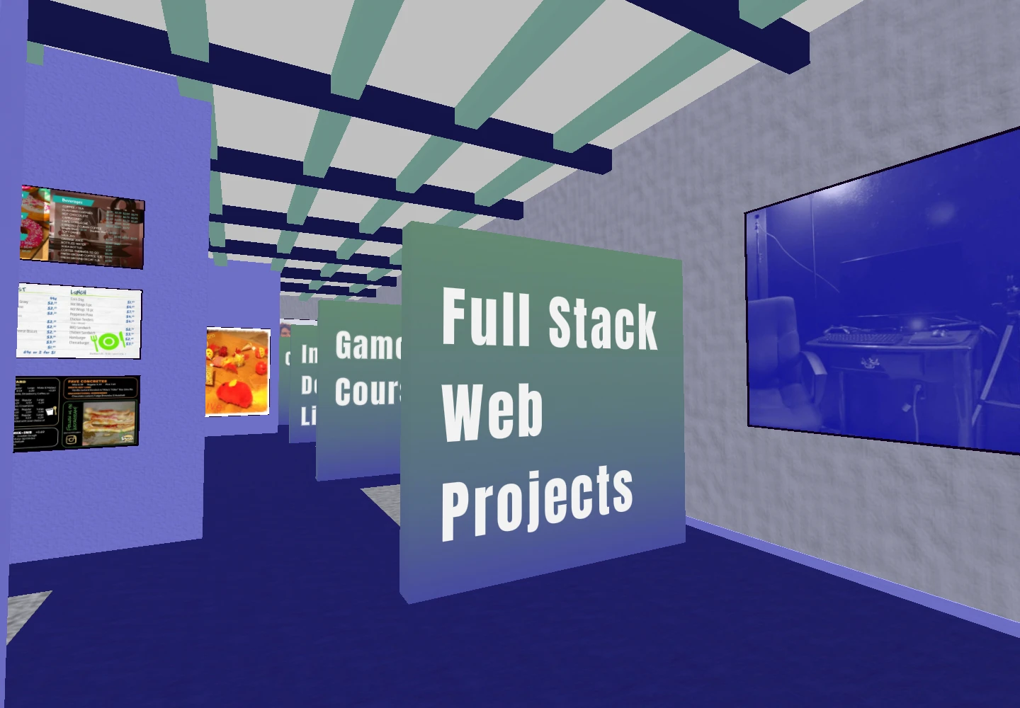
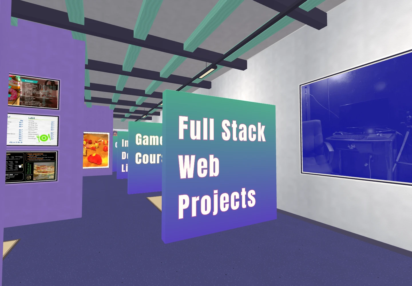
Looking at the comparison images also reminded me of something the original got right: those green-to-purple dividers. The first refresh had turned them a fairly lifeless gray. I brought the gradient back with a brighter green and a stronger violet. The color is part of the surface, so it still receives the room's lighting. A more realistic gallery should still feel like a joyful place to visit.
One last headset pass caught flickering where the script letters overlap. The transparent padding around those letters was writing competing depths at the same surface. Keeping it out of the depth buffer, while still checking the lettering against the solid room, fixed that without adding another rendering pass.
Most of that effect does not require another light in the scene. The panels use luminous materials, the local halos are small pieces of geometry, and the lettering gets its edge treatment in the text shader. Two actual feature lights give the room some direction. There is no real-time shadow pass for every frame on the wall.
The surface detail is shared, too. Plaster, ash, woven fabric, terrazzo, powder-coated metal, and aluminium use small textures generated once when the gallery loads. Their scale is based on metres in the room, so stretching a wall does not turn a fine texture into an enormous pattern. Repeated static pieces are combined where that saves drawing work without making the whole building one indivisible object.
| Original live gallery | Refreshed gallery |
|---|---|
 |  |
A hand should behave like a hand
The headset exposed a problem that looked fine with controllers. The hand models lined up when I held the controllers, then twisted at the wrist when I put them down. The controller's pointing direction was being used for a job that needed the hand's actual anatomy.
The new gloves follow the wrist and finger joints supplied by WebXR. A controller ray still does the pointing; it no longer decides how an articulated wrist should be rotated. Both input modes now wear the same teal fabric glove, with softly padded palms, continuous fingers, and a small pale trim detail. The controller version uses the existing button-driven animation skeleton to pose that glove. Switching input modes no longer means switching to a completely different-looking hand.
My next observation was about grabbing. A precise thumb-and-forefinger pinch worked, but that is not how I naturally pick up a phone. I wanted to curl my fingers around it or support it on an upward-facing palm.
The interaction now checks the palm and fingers against the device's oriented collider. A curled grip can acquire it without a pinch. Opening that grip releases it. An open palm can support it, and tilting the palm lets it go. Once a grip is established, the device keeps its position relative to the hand instead of snapping to an arbitrary pose. Release returns it to physics with the recent motion of the hand.
Passing a device between hands exposed another small but uncomfortable problem. Both hands cannot own the same phone. A successful second grab now transfers it to that hand, keeping its position and rotation at the moment of transfer. The first hand can open or move away without dropping it, and fingers that are still curled do not immediately grab it back.
This is still an interaction model, not a simulation of skin and pressure. It needs to tolerate tracking noise and small occlusions without making a tablet jump. The important distinction is that the gesture follows the thing I am trying to do.
Pinching away from an object still activates the teleport arc. While holding that pinch, twisting the wrist changes the arrow at the destination, giving hands a counterpart to the controller thumbstick's landing-direction control. A small dead zone and smoothing keep tiny wrist movements from making the arrow twitch.
A later headset pass found a more disorienting issue: a brief interruption in pinch recognition could send me to the destination before I meant to move. The release now needs a short, sustained opening of the thumb and finger. An outer ring fills during that confirmation, with the destination and facing held still. Pinching again resumes the aim. Losing tracking cancels it. WebXR also distinguishes a completed selection from a cancelled one; treating every end event as permission to travel was too trusting.
When I stopped to read a tablet or inspect the AR model, tiny movements in my hands made the held content jitter. I added a short settling period: once the hold is quiet, small fluctuations are softened; deliberate movement brings it straight back to following my hand. Position, rotation and scale have bounded tolerances, and the smoothing uses elapsed time so it behaves consistently at different refresh rates. The hands and their interaction checks still use the original tracking data.
Current content, without erasing the old projects
A portfolio can be technically current and still give someone the wrong impression if its content is stale.
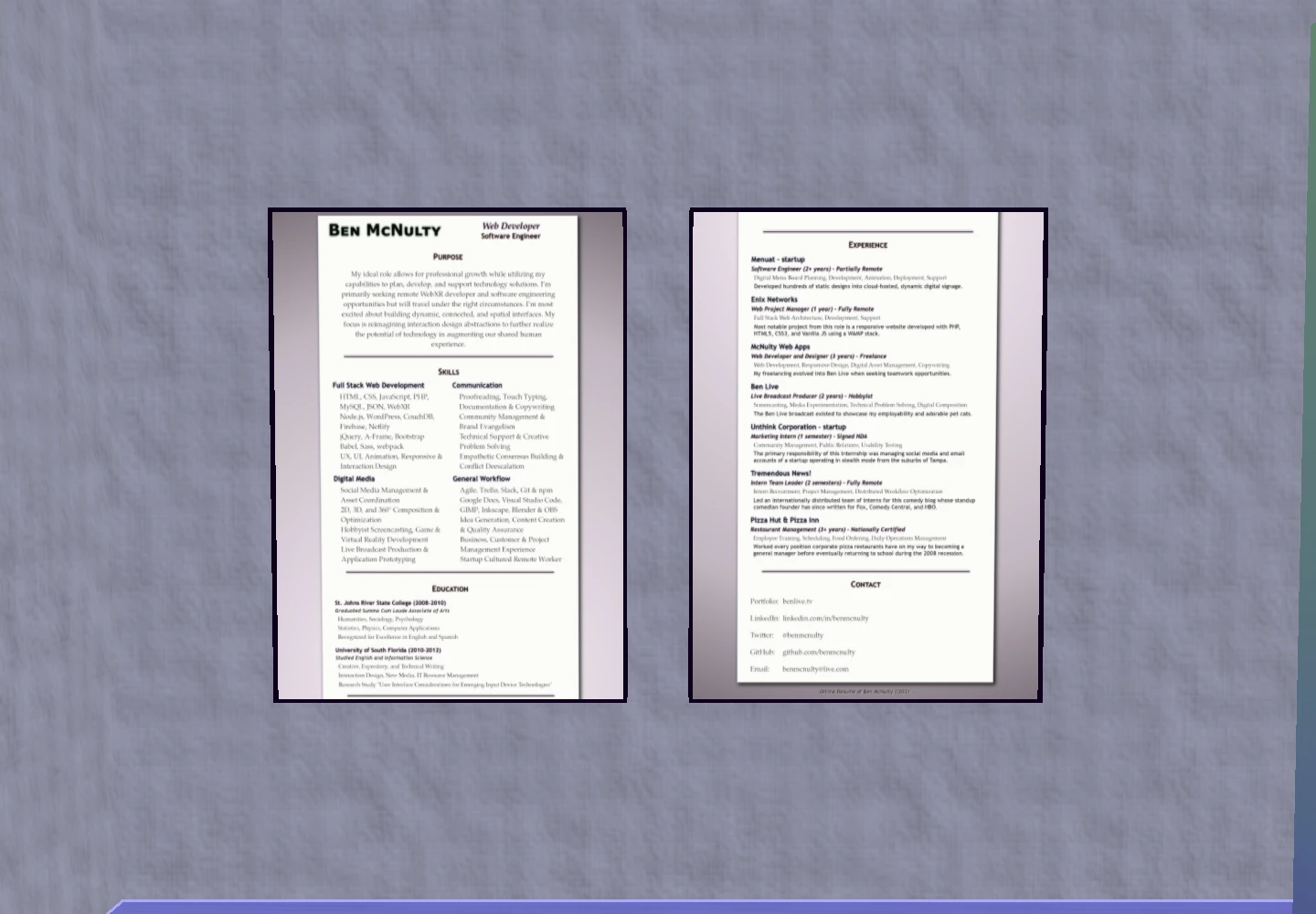
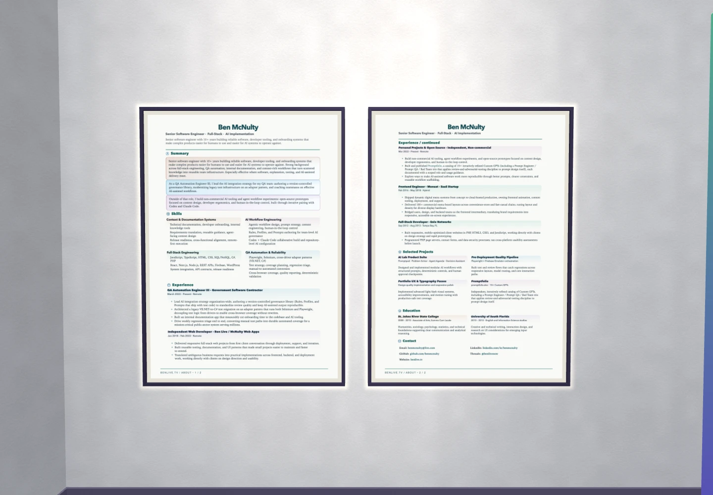
The résumé posters and pickup tablets now use captures of my actual About page. A small capture script arranges complete sections onto two sheets, checks that they fit, and records what was captured. The same images are used on the wall and on the tablets, with matching proportions. They also contain fewer pixels than the old square textures, despite presenting more current information.
The tablet backs say “Ben McNulty.” The contact panel points to LinkedIn for professional conversations and @benlivenow on Instagram and Threads for personal updates. The personal panel says my partner and I have been together since 2012, which will remain true without an annual edit. Descriptions of completed projects stay in the past tense.
| Original live gallery | Refreshed gallery |
|---|---|
 |  |
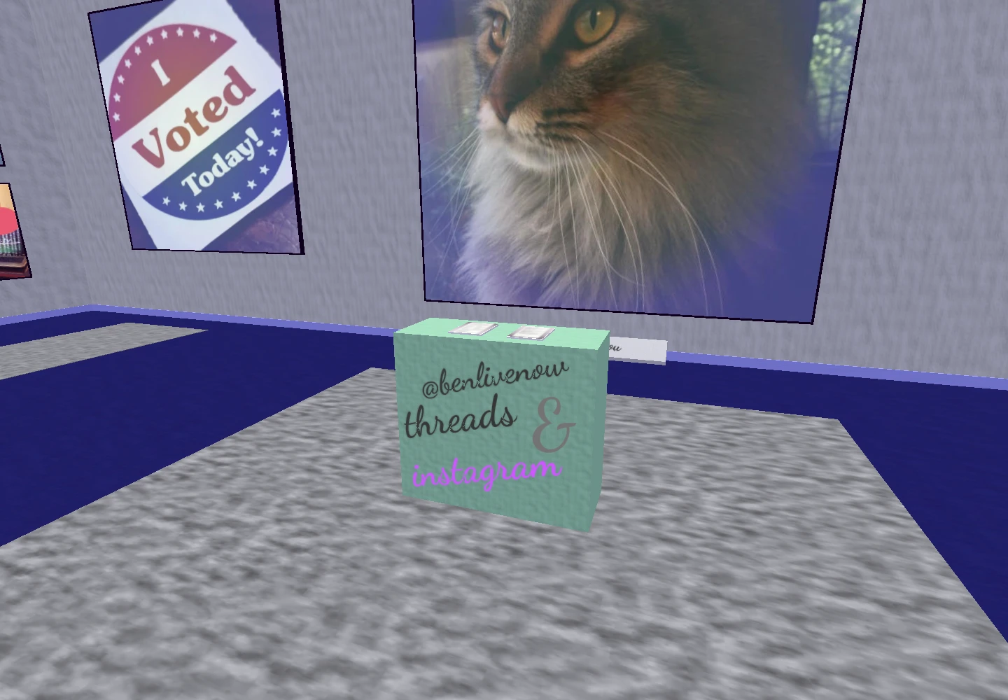
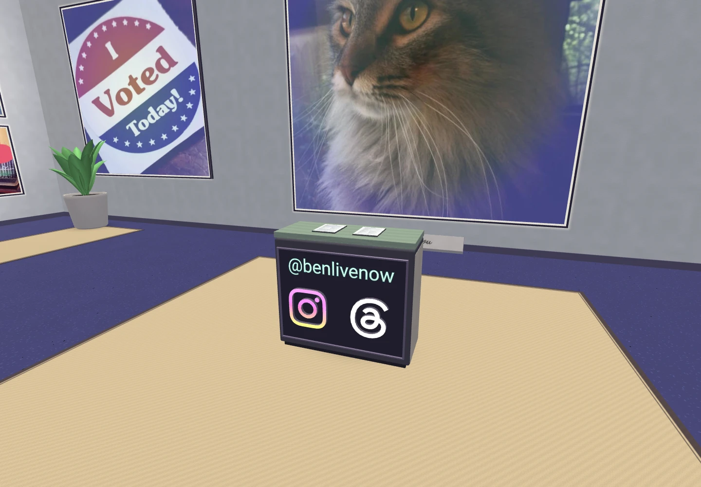
The social podium now carries extruded Instagram and Threads marks and a readable, luminous handle. Those shapes are built from the official brand vectors. They are geometry in the scene, with a little depth and a material finish, rather than another screenshot pretending to be a physical object.
| Original live gallery | Refreshed gallery |
|---|---|
 |  |
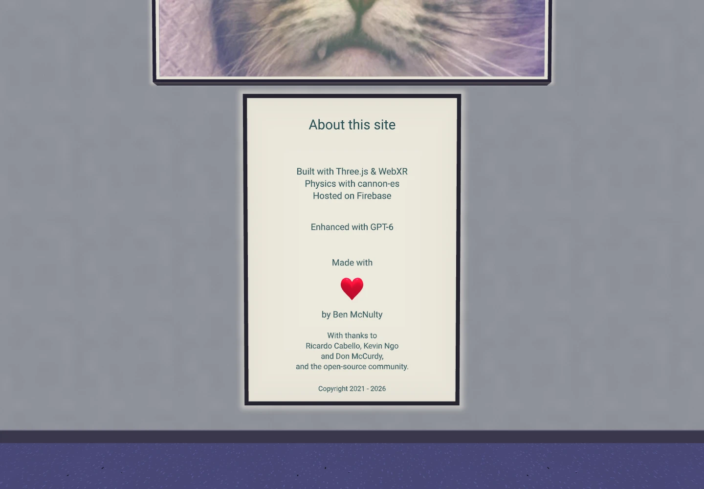
The credits sign is maintained as text now. It names the current technology, credits Claude, Codex, and Muse for the enhancement work, and keeps the “made with love” sentiment with a small red heart, rounded out from the wall with a flat back. I asked for another pass on that shape: a plump little sculpture felt more fitting than a beveled cutout. Updating a sentence no longer means editing an image of a sentence.
| Original live gallery | Refreshed gallery |
|---|---|
 |  |
Stepping inside a photograph
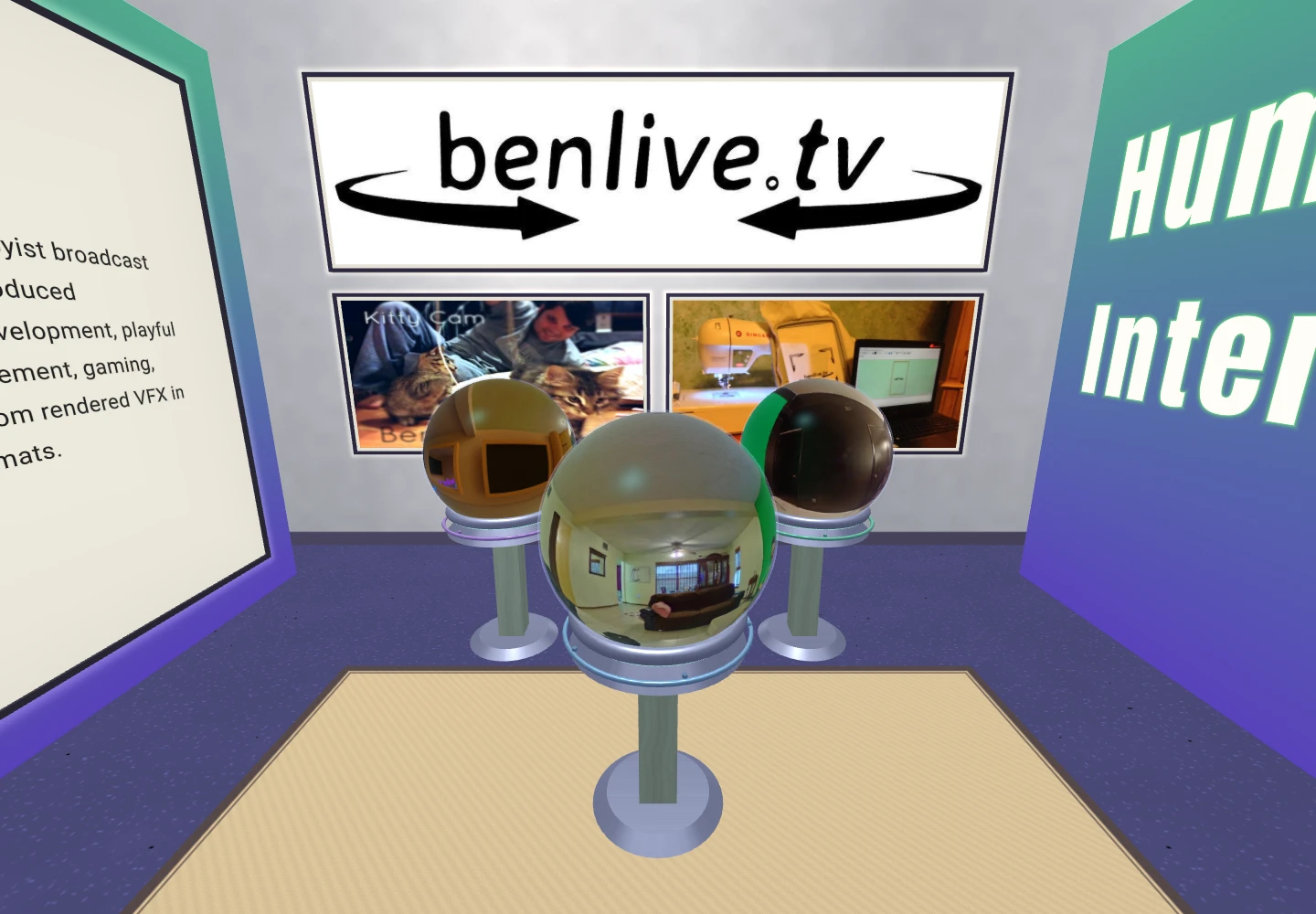
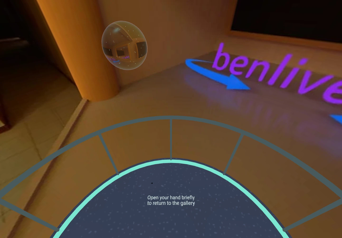
The 360-degree photos were already in the gallery, wrapped around little spheres. I wanted picking one up to mean something. They now sit in illuminated cradles, with smoother surfaces and a restrained crystal finish. Two small, light-faced signs explain the interaction before I reach the spheres, one on each path; the individual pedestal tops have their own colored inlays instead of repeating the same instructions. Holding one starts a short countdown. A small viewing platform rises under me and its rail extends before the gallery fades into the photograph.
The important part is what stays still. Moving the ball in my hand does not move the photograph, turn my head, or carry the platform around. I can look over the rail and down into the image while keeping a familiar floor beneath me. Releasing the ball brings the gallery back with another fade, and the ball follows a soft curve home to its stand. Passing it to my other hand keeps the same visit going. A tracking interruption now freezes the held crystal instead of ending the visit. Returning requires a brief, continuous open-hand gesture, with a small progress ring confirming it. If tracking comes back after my hand has moved, the crystal resumes from its last position without jumping. Desktop visitors can click a crystal and click again, or press Escape, to return.
The crystal keeps its small display texture, while the surrounding view loads a separate viewing version on demand. Most of my original files are only 1024 by 512 pixels. Wrapped Lanczos resampling and a light sharpening pass make the enlargement smoother without inventing detail. A two-image cache limits the extra texture memory; finding the original high-resolution files can come later. A small rim shader and 36 points provide the light inside the held ball; there is no second scene being rendered through it. These are panoramic photographs, so they surround the viewer without pretending to contain walkable three-dimensional geometry. The rail explains that limit, and the navigation controls pause for the visit.
| On display in the gallery | Inside the photograph |
|---|---|
 |  |
I also wanted the room to sound inhabited. The first soundscape was too static: long held tones felt more like a drone than a room I wanted to spend time in. It now moves through a little over four minutes of soft chord swells and sparse bell-like phrases, with changes in register, stereo placement and breathing space. Quiet answering notes and small changes in tone give the phrases more detail without adding more voices. The two entry corners now have ceramic and metal water sculptures, with water sounds positioned at the basins. I can hear the stream clearly up close, and it falls away as I walk farther into the room. Moving ripples and downward-flowing highlights give the water some life using the existing surfaces, with no extra lights or particle systems. Small interaction tones acknowledge a pickup, countdown, return, or teleport. Sound starts when I enter VR or AR. An embossed speaker button on the entrance wall or AR pedestal makes it easy to mute; M on a keyboard and B/Y on a controller still work. An explicit mute is remembered. The same musical bed continues in AR. There, the water sounds move to the room-scale sculpture accents and play more quietly, instead of staying at the old gallery coordinates.
AR needs its own way of looking at the room
Entering AR should give me a useful view of the gallery in my physical space. A life-size room dropped around me is not particularly helpful for that.
The new AR mode presents the gallery as a miniature. The roof and overhead structure are removed from that view, so I can look down into it. Four mint-colored grip rails, mounted on the outside walls, control movement. One handle lets me lift and turn it in any direction; two handles let me change its size and facing. The grip points stay attached to my hands as I turn my wrists. Rotating the model around its own center looked plausible on a screen, but in the headset it pulled the handle away from my palm. The transform now follows the hand around the point where I grabbed it. With two hands, both grip points determine the position and size, while the wrists guide its tilt. The rails accept a palm-down grip as well as a pinch: the acquisition check includes my palm and curled knuckles, with a brief allowance for closing my hand just before reaching the rail. Touching the walls or reaching toward a tablet no longer grabs the entire room. It starts below eye level at a smaller, easier-to-survey scale, facing the entrance, using the headset’s current viewing pose. That makes it feel intentionally presented instead of left on the floor. The hanging feature-light fixtures are left out along with the roof.
The miniature rests on a low pedestal that stays put when I lift the gallery away. It can float wherever I leave it. When the gallery overlaps the pedestal, or comes within its small magnetic margin, the rim changes color and asks me to release. The collision check follows the rotated gallery volume, so I don’t have to line up its center precisely. It then settles back into its original position, facing and size. Letting go far away leaves it alone, and losing hand tracking does not trigger a return.
The larger welcome placard sits higher ahead of me, with a fountain on the floor at each side and a familiar rug underfoot. Supported surface detection checks for a stable floor and room boundaries. The sign and both fountains fit together as one arrangement in front of the detected walls; smaller rooms get a more compact version with all three features still present. The pedestal, rug and welcome arrangement share a placement plan. Entry waits for a stable headset pose, and the pedestal starts farther forward with room left for me to stand. Floor fitting can move it a short distance to find a supported footprint. Once I pick up the gallery, its pedestal stays put. Placement settles once, rather than chasing every tracking adjustment. Without that data, the local-floor reference provides a clearly labeled preview and a floating welcome arrangement; the controls include a rescan option. These are virtual furnishings, of course. The pedestal is not something to lean on.
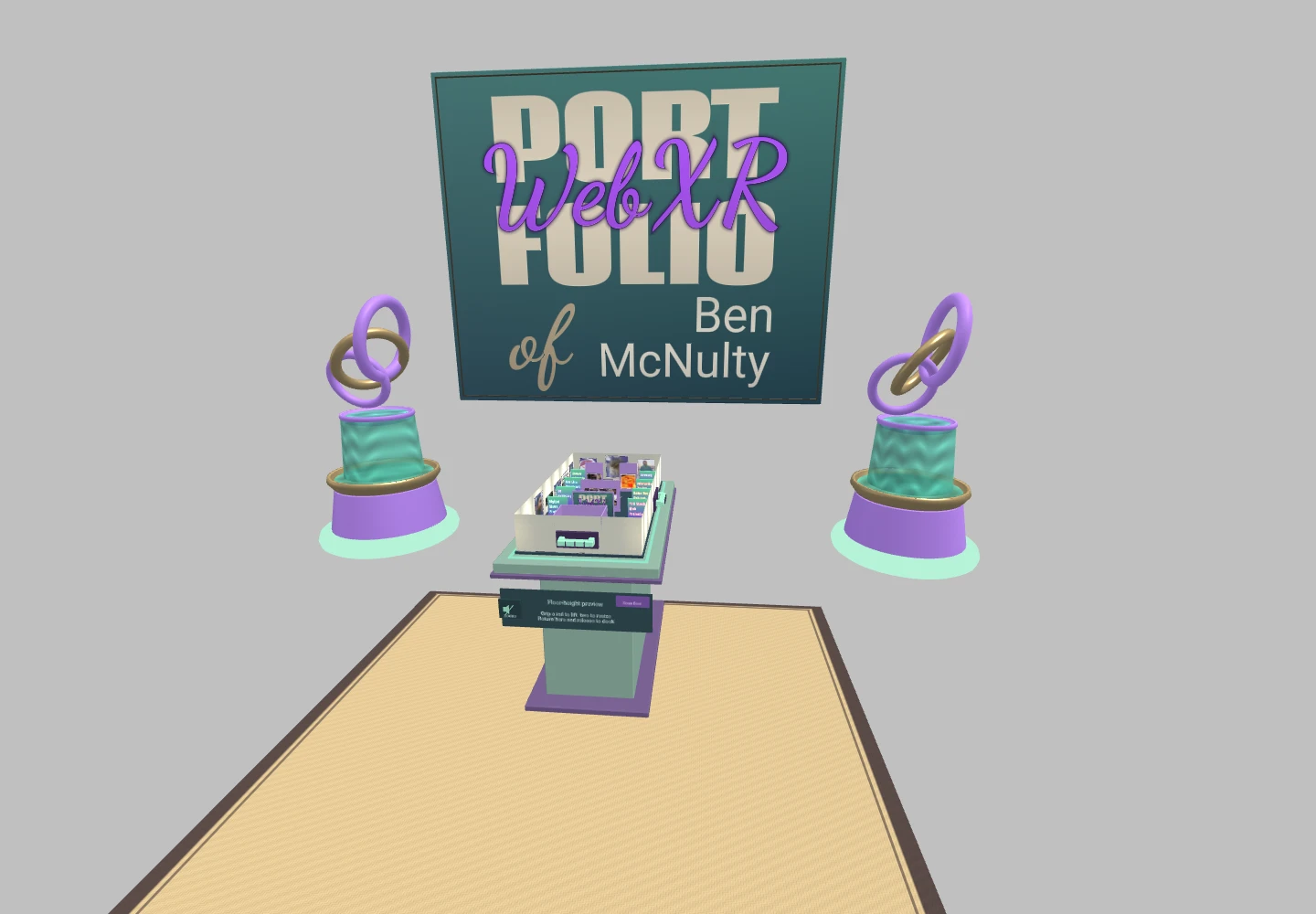
Desktop capture of the AR arrangement. In the headset, the real room shows through the surrounding space.
The miniature reuses the gallery's exhibit geometry and materials, with a compact beveled base beneath the room. The full-size physics world pauses while it is open. The miniature also gets its own batching: with the entire room in view, combining static labels, crystal shells, and repeated construction pieces saves considerably more drawing work than the full-size room’s smaller visibility groups. Returning from AR restores the regular gallery and my previous desktop position. That avoids scaling a physics simulation down, then hoping it will return to normal afterward.
A tiny résumé is still a tiny résumé. Touching a tablet or crystal in the model brings out a separate copy at a comfortable viewing size, independent of how large I have made the gallery. Controllers can point and select them too, with a small aiming line showing the target. I can grab these copies, turn them over, pass them to the other hand, and leave them floating where I want to look at them. A separate Return button puts each one away. Up to four can stay open at once. While either hand holds a gallery rail, pokes and selections pause for both hands. A brief pause after letting go keeps a releasing finger from opening a tablet by accident. The actual tablet and its physics remain where they were.
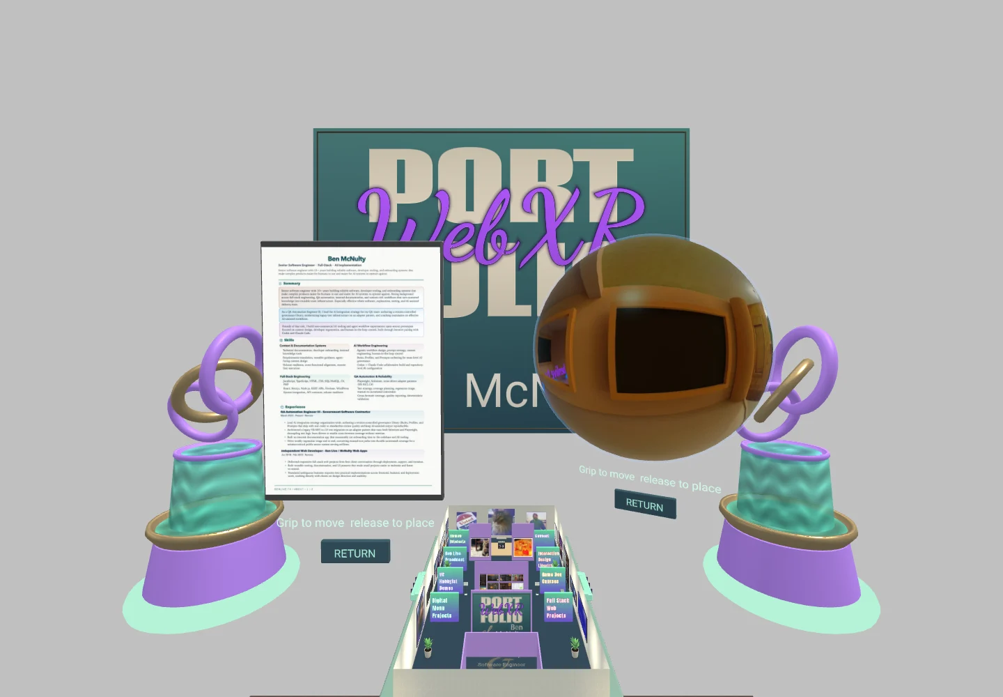
Desktop capture of persistent AR exhibits. Release leaves each copy in place; its Return button puts it away.
Apple’s gaze-and-pinch input also needs its own handling. Its temporary pinch sources arrive through session events, and the hand’s grip pose is separate from the gaze ray. The implementation uses that grip pose to carry an object and, when a rotation is available, to steer the arrival direction. Source removal and cancellation never complete a stale teleport. Crystal visits remain in place through those interruptions; completed releases still need a short confirmation interval. That path has simulated-input coverage; a physical Vision Pro check is still ahead.
Smooth is something I have to check
The Quest 3 feedback on the earlier refreshed build was encouraging: the scene looked good and movement felt smooth. That was useful evidence, but it did not prove that every later change would be free.
Angled edges were still sharper than I wanted. Enabling native antialiasing looked noticeably better when I tried it in the Quest 3, so that smoother view is the baseline now. The headset quality choices remain available, along with an off setting for comparison. I want to keep improving the appearance without giving up comfortable movement. A stack of full-screen effects is not worth it if the room stops feeling smooth.
Desktop rendering has its own resolution budget. On the development Mac, the actual browser canvas kept a roughly 60 Hz cadence across five views with smoothing enabled, including a Retina-sized buffer capped at 4.2 million pixels. Those measurements include the running gallery; an offscreen rendering benchmark had made the desktop cost look much worse. Testing the path people actually use matters.
The automated checks cover loading, text layout, texture use, collisions, controller behavior, hand gestures, teleporting, and AR entry and exit. Desktop GPU measurements help me spot expensive changes. The headset passes confirmed the improved locomotion and edge quality and helped refine the grabbing. Automated checks now cover passing a device between hands, including the first hand letting go afterward. I then tried the hand-to-hand transfer in the Quest 3, where it worked smoothly. The miniature AR interactions have automated coverage, with broader device testing still ahead. I tried the crystal visits and AR inspection in the Quest 3, then used that feedback to refine accidental grabs, tracking interruptions and the presentation around the miniature. Those latest refinements still need their own headset check. A desktop timing result or an emulated headset cannot settle how every interaction will feel on every device.
That is also why I wanted the gallery back in the main paths through the site. It gives visitors a working project to inspect alongside the résumé and project descriptions. The Hire Me page now gives it a direct entrance, alongside the other ways to learn about my experience.
Explore the gallery on a regular screen, or open the same page in a compatible headset. The résumé and conventional portfolio remain available if a walk through a 3D room is not how you want to browse.
Technical references
- Three.js WebXRManager: controller, grip and hand spaces; headset rendering controls.
- WebXR Hand Input: articulated joint poses and anatomical axes.
- WebXR input actions: successful selections and cancelled actions have different event sequences.
- Meta hand interaction design: comfort, feedback, and accommodating the limits of tracking.
- WebKit natural input for Apple Vision Pro: temporary pinch sources, session events, gaze rays, and grip poses.
- Instagram brand resources and Threads brand resources: source geometry for the podium marks.