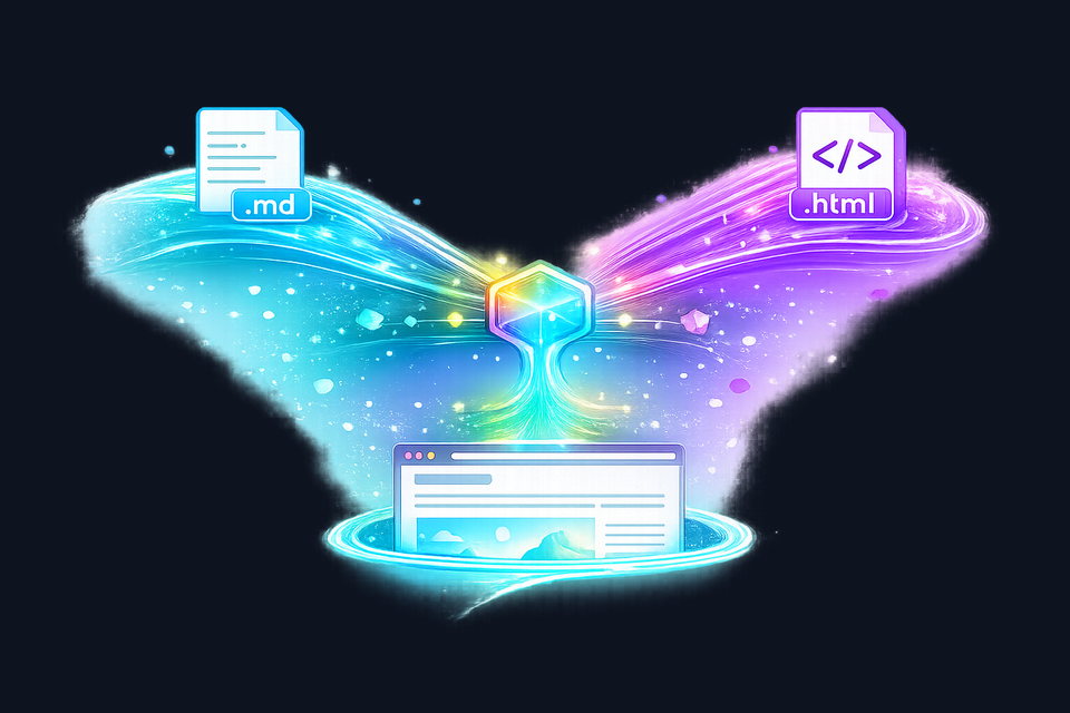
Most developer blogs pick a format and stick with it. Markdown is the default: write in plain text, render to HTML, ship. It works. But there are articles where Markdown's simplicity becomes a constraint: interactive demos, custom layouts, embedded visualizations, or any content where you need precise control over the DOM.
This blog now supports both. Markdown articles and HTML articles flow through the same content pipeline, share the same frontmatter system, and render inside the same page shell with all the site's default styling intact. An HTML article only needs to provide its custom overrides; everything else comes for free.
This post explains how that works, and also covers the responsive media pipeline that processes artist-generated illustrations into pixel-perfect variants for every screen size.
The Content Architecture
Every article on this blog is a file in /content/blog/ registered in a central index.json manifest. The content loader reads each file, extracts frontmatter, and either parses the body as Markdown or injects it directly as HTML, decided entirely by file extension.
The key design decision: both formats use the same --- frontmatter block. This means the listing page, SEO meta tags, social sharing cards, and media resolution all work identically regardless of whether the article body is Markdown or HTML.
Markdown: The Default Path
Most articles are Markdown. The content loader fetches the file, splits the frontmatter, and passes the body through a custom parser that converts it to semantic HTML. The parser handles headings, code blocks with language classes and copy buttons, tables, blockquotes, lists, inline formatting, images, and links.
The parser also escapes all user content before wrapping it in HTML tags, a security measure that prevents any accidental script injection from Markdown source files. This is the right tradeoff for Markdown: the format is meant to be simple and safe.
HTML: Full Control When You Need It
HTML articles bypass the Markdown parser entirely. After frontmatter extraction, the body is injected directly into the article container via innerHTML. This means you get the full power of HTML and CSS inside the article: inline <style> tags for custom styling and any HTML structure you need. Note that <script> tags are preserved in the DOM but not executed, since innerHTML does not evaluate injected scripts per the HTML specification.
The article you're reading now is an HTML article. That pipeline diagram above? It's a CSS Grid layout with custom-styled badges, something that would be clumsy to express in Markdown. The code comparisons below use a side-by-side grid that would be impossible in plain Markdown.
What You Get for Free
HTML articles inherit the full blog styling system automatically:
| Feature | Source | Override Needed? |
|---|---|---|
| Typography (headings, body, code) | blog.css | No |
| Dark/light theme switching | theme-toggle.js + CSS variables | Only for custom elements |
| Responsive layout + reader scaling | blog.css + article.js | No |
| Hero image with srcset + WebP | article.js + frontmatter | No |
| SEO meta + Open Graph + JSON-LD | article.js + blog-utils.js | No |
| Reading progress + time estimate | article.js | No |
| Heading permalinks + copy links | article.js | No |
| Theme-aware inline images | article.js | No |
An HTML article's inline <style> block only needs rules for its own custom components. The base typography, spacing, color system, theme switching, and responsive behavior are already in place.
The Frontmatter Contract
Both formats share exactly the same frontmatter schema:
---
title: My Article Title
date: 2026-02-22
summary: A short description.
status: published
tags: web, css, javascript
heroImageDark: /img/blog/slug/hero-dark-960w.jpg
heroImageLight: /img/blog/slug/hero-light-960w.jpg
cardImageDark: /img/blog/slug/hero-dark-og.jpg
cardImageLight: /img/blog/slug/hero-light-og.jpg
imageAlt: Descriptive alt text.
---

# My Article Title

Article body in **Markdown**...---
title: My Article Title
date: 2026-02-22
summary: A short description.
status: published
tags: web, css, javascript
heroImageDark: /img/blog/slug/hero-dark-960w.jpg
heroImageLight: /img/blog/slug/hero-light-960w.jpg
cardImageDark: /img/blog/slug/hero-dark-og.jpg
cardImageLight: /img/blog/slug/hero-light-og.jpg
imageAlt: Descriptive alt text.
---
<style>
/* Custom overrides only */
</style>
<h1>My Article Title</h1>
<p>Article body in <strong>HTML</strong>...</p>The content loader's flat frontmatter parser handles both identically: it splits on the --- delimiters, parses key-value pairs, and returns the same data structure regardless of what follows.

The Responsive Media Pipeline
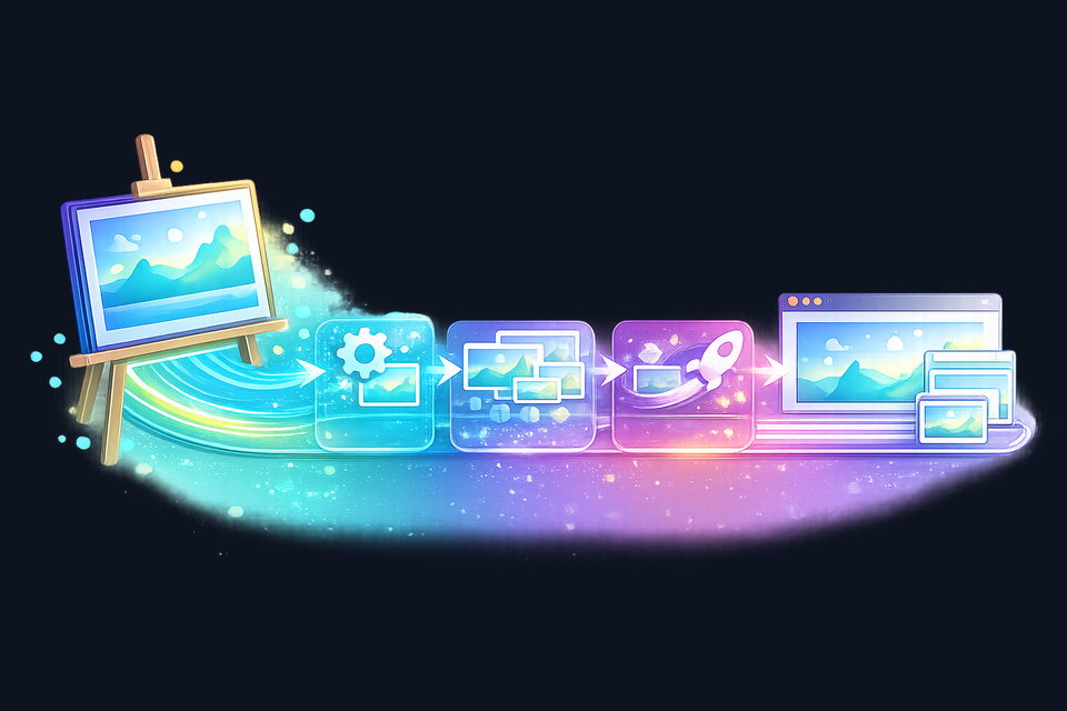
Every article, whether Markdown or HTML, benefits from the same image delivery system. Source illustrations (generated using AI image tools and curated to match the site's prismatic color palette) are processed through a Python pipeline into optimized responsive variants.
From Source to Delivery
Each illustration starts as a high-resolution PNG with a transparent background in our site's prismatic color palette. A single command processes them:
python3 scripts/blog/process-blog-images.py <article-slug>Each source image is a single transparent PNG. The pipeline composites it onto dark and light backgrounds, then encodes at 4 responsive widths in both WebP and JPEG, producing up to 12 responsive output files per source:
Hero images also get a social sharing crop at 1200×630 for Open Graph cards: one neutral WebP plus dark and light JPEG variants, adding 3 files. A single hero source produces 15 optimized files. Three inline illustrations add 36 more, bringing this article's total to 51 responsive assets from 4 source images.
Browser Delivery
The blog uses the <picture> element with <source> for WebP and <img> fallback for JPEG. Both carry full srcset and sizes attributes computed from the actual CSS layout math:
<picture>
  <source type="image/webp"
          srcset="hero-1536w.webp 1536w,
                  hero-1280w.webp 1280w,
                  hero-960w.webp 960w,
                  hero-640w.webp 640w"
          sizes="(min-width: 2560px) 1536px,
                 (min-width: 1920px) 1280px,
                 (min-width: 1440px) 979px,
                 (min-width: 1088px) 90vw, 100vw">
  <img src="hero-dark-960w.jpg"
       srcset="hero-dark-1536w.jpg 1536w, ..."
       width="960" height="640"
       alt="...">
</picture>
WebP sources are theme-neutral: the same file serves both dark and light modes because WebP preserves the original transparent-background illustration. JPEG sources carry the theme suffix (hero-dark-960w.jpg) because JPEG requires an opaque background. The browser picks the optimal width variant automatically. On a 1440px viewport, it loads the 960w image. On a 4K display, it loads the 1536w. Mobile devices get the 640w. No wasted bandwidth, no blurry scaling.
Theme-Aware Image Switching
Both hero and inline images participate in theme switching. When the user toggles between dark and light mode, JavaScript swaps the src attribute on every themed image. Inline article images use a naming convention (illustration-1-dark-960w.jpg → illustration-1-light-960w.jpg) that the loader detects automatically and applies data-theme-image-dark / data-theme-image-light attributes for switching.
Why Both Formats?
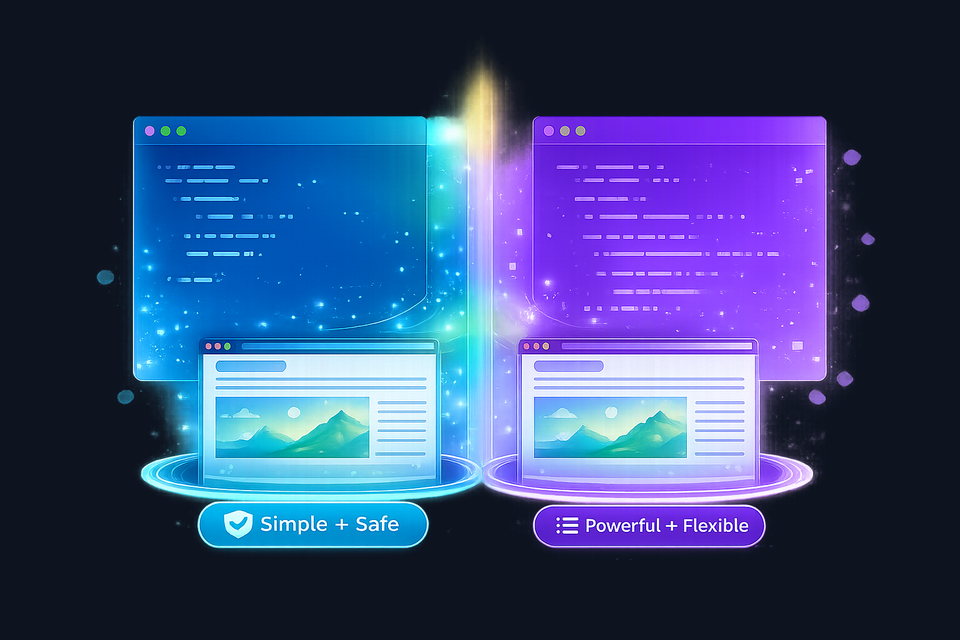
Markdown is right for most content. It's fast to write, hard to break, and the parser handles security (escaping HTML entities before rendering). For a dev blog where the content is primarily prose with code snippets, Markdown removes friction.
But some articles are about the web itself: demonstrating CSS techniques, showing interactive components, or (like this one) using custom layouts that make the content more effective. For those, writing HTML with inline styles is more natural and more capable than fighting Markdown's limitations.
The dual-source approach means we never have to choose. Each article uses whichever format serves its content best, and the reader never knows the difference.
Implementation Details
For developers interested in the mechanics, here's how the content pipeline branches:
| Stage | Markdown (.md) | HTML (.html) |
|---|---|---|
| File registration | index.json (same for both) | |
| Frontmatter extraction | splitFrontmatter() (same parser) | |
| Body processing | MarkdownParser.parse() | Direct injection (no parsing) |
| Security model | All content escaped by parser | Author-trusted (same as any page) |
| Inline styles | Not supported | <style> tags preserved |
| Inline scripts | Escaped by parser | <script> tags preserved but not executed |
| Theme switching | Automatic (same JS handles both) | |
| SEO / social cards | Identical (driven by frontmatter) | |
The security model difference is worth noting. Markdown articles are sanitized: the parser escapes HTML, preventing injection even if the source file were compromised. HTML articles are trusted, like any other page on the site. This is the right tradeoff: HTML articles are authored by the site owner, not user-generated content.
What's Next
The foundation is in place: two content formats, one pipeline, responsive media at every breakpoint. Future improvements might include:
- AVIF support: adding a third format tier for browsers that support it, further reducing file sizes
- Interactive HTML articles: embedding live code playgrounds, interactive diagrams, or data visualizations
- Automated content validation: CI checks that verify frontmatter completeness and image pipeline output for every article
The goal isn't complexity for its own sake. It's having the right tool available when the content demands it, while keeping the default path simple and fast.